Precision, but make it cultural
Switzerland has a way of turning restraint into influence. In a country often associated with neutrality, chocolate, banking, and mountain scenery, design has quietly become one of its most powerful exports. Swiss design is not loud. It rarely chases trends. Yet it shapes the objects we use, the interfaces we trust, the spaces we inhabit, and even the way brands communicate credibility.
What makes Swiss design so influential is not a single aesthetic formula. It is a mindset: clarity, functionality, discipline, and a near-obsessive respect for detail. In a digital era overflowing with visual noise, that mindset feels less like tradition and more like a survival strategy. Why do some of the world’s most successful products feel instantly intuitive? Quite often, the answer can be traced back to principles developed in Switzerland.
The roots of Swiss design: clarity as a method
Swiss design, also known as the International Typographic Style, emerged in the mid-20th century and changed global visual culture. Its core principles were simple but radical: asymmetric layouts, grid-based composition, sans-serif typography, and a focus on objective communication over decorative flair. The idea was not to impress the viewer with ornament, but to communicate with maximum efficiency.
That approach reflected Switzerland itself: multilingual, orderly, and deeply pragmatic. In a country where German, French, Italian, and Romansh coexist, visual communication had to be legible across linguistic boundaries. Design became a tool for precision and social cohesion, not merely aesthetics.
Names like Josef Müller-Brockmann, Max Bill, and Armin Hofmann helped define this movement. Their work did not stay in museums or classrooms. It became the visual grammar of modern institutions, corporations, transit systems, and editorial design across the world.
Even now, if you look at a clean poster layout, a minimalist museum identity, or a carefully structured corporate report, you are likely seeing Swiss design DNA at work.
Typography: Switzerland’s most underrated global export
Typography is one of the clearest examples of Swiss influence on modern culture. Helvetica, created in 1957 by Max Miedinger and Eduard Hoffmann, is probably the most famous Swiss typeface and one of the most widely used fonts in the world. It appears on public transit systems, corporate logos, signage, and countless interfaces. Its power lies in its neutrality. Helvetica does not demand attention; it facilitates it.
That may sound unglamorous, but in a media environment flooded with visual stimulation, neutrality is a superpower. Swiss typography allows content to breathe. It helps brands appear trustworthy. It gives institutions a sense of order. It is no accident that governments, airlines, luxury houses, and tech companies have all borrowed from this visual language.
And the influence goes beyond Helvetica. Swiss typography shaped how editorial design works, how information is hierarchically organized, and how readers navigate content. The modern website layout, the clean annual report, the minimal app interface, the subway map that does not require a decoder ring — all owe something to this tradition.
Typography in the Swiss tradition answers a practical question: how do you make information feel effortless to read? The answer, it turns out, is a lot of invisible work.
From clocks to UX: why Swiss precision fits the digital age
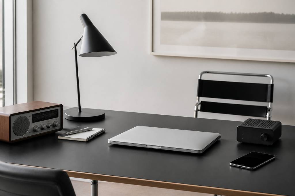
There is a reason Swiss design has transitioned so well into technology. Digital products live or die by usability. If a button is confusing, if a layout is cluttered, if the hierarchy is unclear, users leave. Swiss design principles were built for exactly this kind of challenge. They prioritize structure, legibility, and purpose.
Modern user experience design owes a surprising amount to the Swiss playbook. Grids help organize content across devices. Strong typographic hierarchy makes scanning easier. Visual restraint reduces cognitive load. In other words, the design philosophy that once shaped posters and print systems now helps people navigate apps, dashboards, and digital services without frustration.
Swiss tech companies have also embraced this logic in hardware design. Switzerland is not Silicon Valley, and it does not try to be. Instead, it often emphasizes reliability, elegant engineering, and longevity. Think of the country’s reputation in watchmaking, precision instruments, and high-end medical devices. These industries share a common trait: trust must be built into the design itself.
In a time when many products are built to be replaced quickly, Swiss design tends to ask a different question: how can this be made to last, function beautifully, and remain understandable over time?
Watches, tools, and the aesthetics of reliability
Swiss watchmaking is one of the most visible examples of design becoming culture. A Swiss watch is not just a device for telling time. It is a concentrated statement about craftsmanship, engineering, identity, and status. The appeal is not limited to luxury buyers. Even at the entry level, Swiss-made watches benefit from an aura of reliability and disciplined design.
What is striking is how this sector balances tradition and innovation. Mechanical watches preserve centuries-old techniques, yet the design language continues to evolve. Brands experiment with materials like ceramic, titanium, carbon composites, and sapphire crystal. Dial layouts are refined for clarity. Movements are engineered with astonishing precision. The result is an object that feels both technical and deeply human.
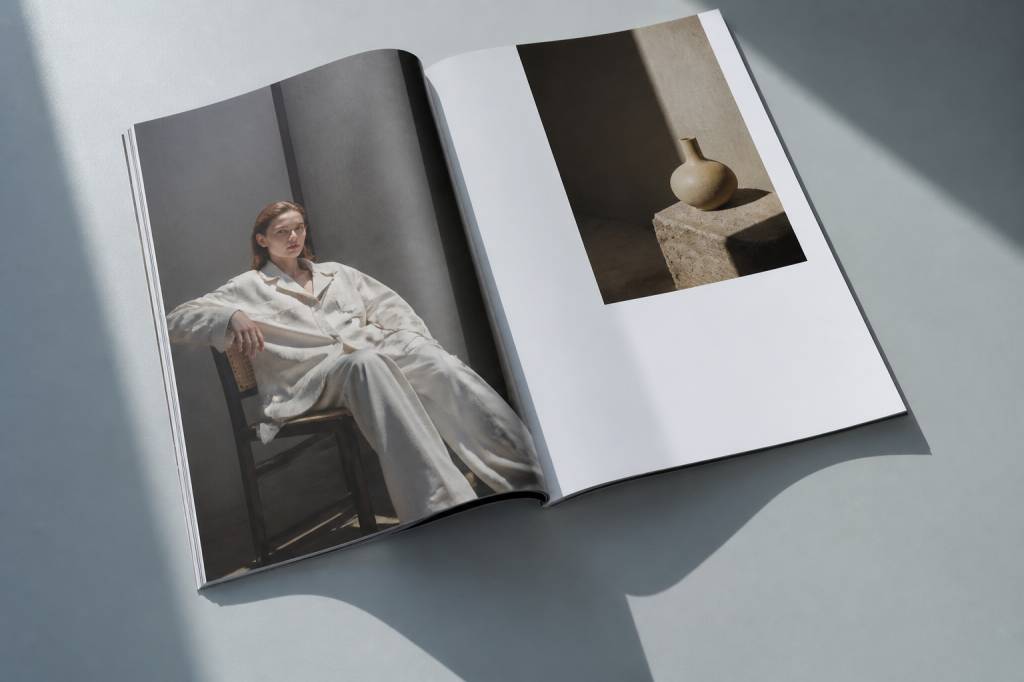
This same logic appears in other Swiss-designed products: kitchen tools, bicycles, furniture, medical equipment, and everyday objects that quietly improve daily life. The form is often understated, but the experience is deliberate. A well-designed Swiss object tends to reward prolonged use. It does not merely look refined on day one; it continues to make sense after years of handling.
That may be why Swiss design resonates in a disposable world. It offers an alternative to planned obsolescence. It says, in effect: if something is worth making, it is worth making well.
Minimalism with purpose, not just style
Swiss design is often mistaken for simple minimalism. That is only half the story. Minimalism can be a trend — a visual shorthand for sophistication. Swiss design is more exacting. Its restraint is not about looking sparse for the sake of aesthetics. It is about removing anything that does not serve the message, object, or user.
This distinction matters. A minimalist room can feel empty. A Swiss-influenced room feels intentional. A minimalist logo can feel generic. A Swiss-informed brand system feels structured and dependable. The philosophy is not “less is more” as a slogan. It is “every element must justify its existence.”
That principle has made Swiss design especially influential in lifestyle culture. Interior design, packaging, retail spaces, and hospitality concepts increasingly borrow from its clarity. Neutral palettes, open layouts, efficient signage, and precise material choices all echo the Swiss preference for function supported by elegance.
Is it possible that the reason so many contemporary lifestyles gravitate toward calm, uncluttered environments is because our visual culture has become so overloaded? Swiss design offers an answer without shouting it.
Architecture, public space, and the logic of trust
Switzerland’s design influence is also visible in architecture and urban planning, where the relationship between order and daily life becomes concrete. Swiss architecture is often characterized by a respect for materials, a rational approach to structure, and a preference for buildings that integrate rather than dominate their surroundings.
This does not mean Swiss architecture lacks ambition. On the contrary, the country is home to architects and firms known for elegant problem-solving, thoughtful urban interventions, and a strong dialogue between old and new. The best Swiss spaces often feel calm because they are designed to reduce friction: intuitive wayfinding, practical layouts, high-quality materials, and attention to how people actually move through space.
That logic extends to public infrastructure, where Switzerland has become famous for transport systems that are both efficient and visually coherent. Train stations, timetables, signage, and maps are often designed with the same clarity found in Swiss typography. The result is more than aesthetic coherence. It creates trust.
And trust, in cities, matters. People are more likely to use systems they can understand at a glance. That is why Swiss design is not just a cultural export. It is a civic one.
How Swiss aesthetics influence brands today
Many global brands borrow from Swiss design, even when they do not openly say so. The telltale signs are easy to spot: generous white space, strict typographic hierarchy, restrained color palettes, modular layouts, and a tone that signals competence over hype. Luxury brands use it to communicate exclusivity. Tech companies use it to signal usability. Institutions use it to project seriousness.
Why does this work so well? Because consumers are surrounded by noise. Flashy design can attract attention for a moment, but clarity creates confidence. A clean interface suggests a product is well thought out. A structured brand system suggests consistency. A disciplined visual identity suggests professionalism.
Of course, the line between inspiration and imitation can get blurry. Many brands adopt “Swiss-looking” aesthetics without understanding the underlying philosophy. The result can be sterile and formulaic. Swiss design at its best is not cold. It is generous. It respects the viewer’s time.
That is a lesson more companies could use. If a design system makes people work harder to understand it, is it really modern?
Sustainability and the new value of durability
In the context of sustainability, Swiss design feels especially relevant. The modern consumer is increasingly aware of waste, disposable products, and the environmental cost of constant replacement. Swiss design’s emphasis on durability, timelessness, and repairability aligns neatly with these concerns.
This matters in both product design and lifestyle culture. Objects that last longer are often better for the planet. Systems that are easy to understand are easier to maintain. Designs that avoid trend-chasing can remain in use for decades, which reduces the need for constant reinvention.
Some of the strongest Swiss-inspired products are not designed to dazzle at launch but to remain useful over time. That includes furniture built for longevity, tools designed for repair, and packaging that minimizes waste while maintaining clarity. The appeal is not nostalgia. It is efficiency with a conscience.
As sustainability becomes less of a niche concern and more of a baseline expectation, Swiss design looks less like a historical style and more like a blueprint for responsible modern living.
Why Swiss design still feels ahead of the curve
Swiss design continues to matter because it solves problems that have only become more complicated. We live in a world of shrinking attention spans, interface overload, and endless visual competition. In that context, clarity is not old-fashioned. It is radical.
Swiss design offers a disciplined response to chaos. It helps people read faster, navigate better, trust more easily, and live with fewer distractions. That may sound modest compared to the loud promises of trend-driven design, but its influence is everywhere: in the apps we tap, the logos we recognize, the spaces we move through, and the products we keep for years.
The deepest strength of Swiss design may be that it does not try to dominate culture. It shapes culture by making it easier to use. That is a rare kind of power, and one that modern technology and lifestyle brands continue to borrow from — whether they realize it or not.
So the next time a screen feels intuitive, a watch feels timeless, or a room feels quietly composed, there is a good chance Swiss thinking is somewhere behind it. Not as decoration. As structure.