Few book covers have achieved the kind of cultural afterlife reserved for Mary Shelley’s Frankenstein. The novel itself has spent two centuries mutating in the public imagination, but its cover art has done something just as important: it has turned a literary classic into a visual myth. A stitched-together monster, a storm-lit castle, a laboratory crackling with electricity, a single heavy Gothic font—each design choice has helped define how generations see the story before they even open the first page.
That matters more than it might seem. Cover art is not just packaging. For a book as frequently reissued, adapted, and repurposed as Frankenstein, it becomes part of the text’s cultural meaning. The covers tell us whether the novel is a horror story, a philosophical warning, a feminist breakthrough, a science-fiction origin point, or all of the above. And sometimes, they tell us more about the era producing the edition than about Shelley’s original work.
Why Frankenstein’s cover art matters so much
Some books are remembered for their plots. Frankenstein is remembered for its iconography. The monster’s flattened bolts, the shadowy laboratory, the frozen expression of the scientist facing consequences he cannot reverse—these images have escaped the book and entered pop culture. But the cover art also plays a key role in that process. It acts as the first translation of the novel into a visual language.
What makes this especially fascinating is that Shelley’s 1818 novel has no single official image attached to it. Unlike later works that were adapted quickly into film, Frankenstein acquired its visual identity gradually, through stage productions, illustrations, pulp editions, academic reprints, horror paperbacks, and luxury classics. In other words, the cover became a site of interpretation. Every new edition asked a question: what is Frankenstein really about?
The answers changed over time. Early editions often emphasized the tragic, literary, and philosophical dimensions of the text. Later covers leaned heavily into gothic horror. Mid-20th-century mass-market paperbacks turned the novel into a monster show. Contemporary editions often split the difference, balancing elegance with menace, suggesting that the story belongs to both literary canon and modern genre culture.
The power of the Monster image
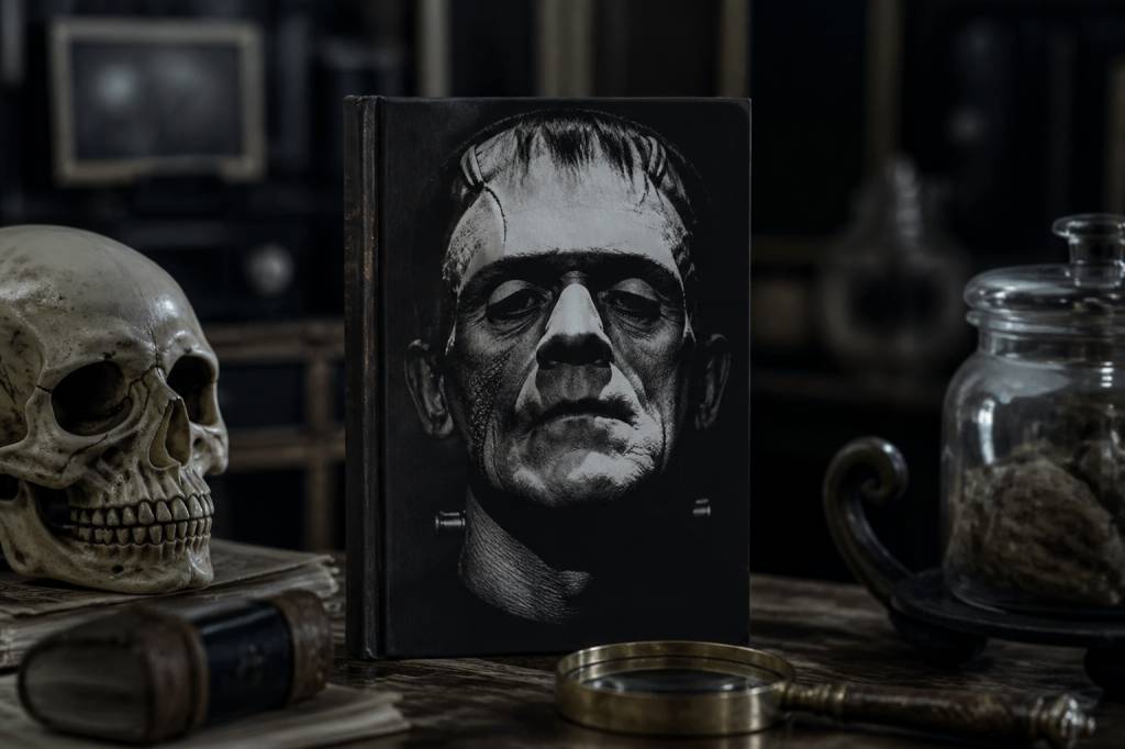
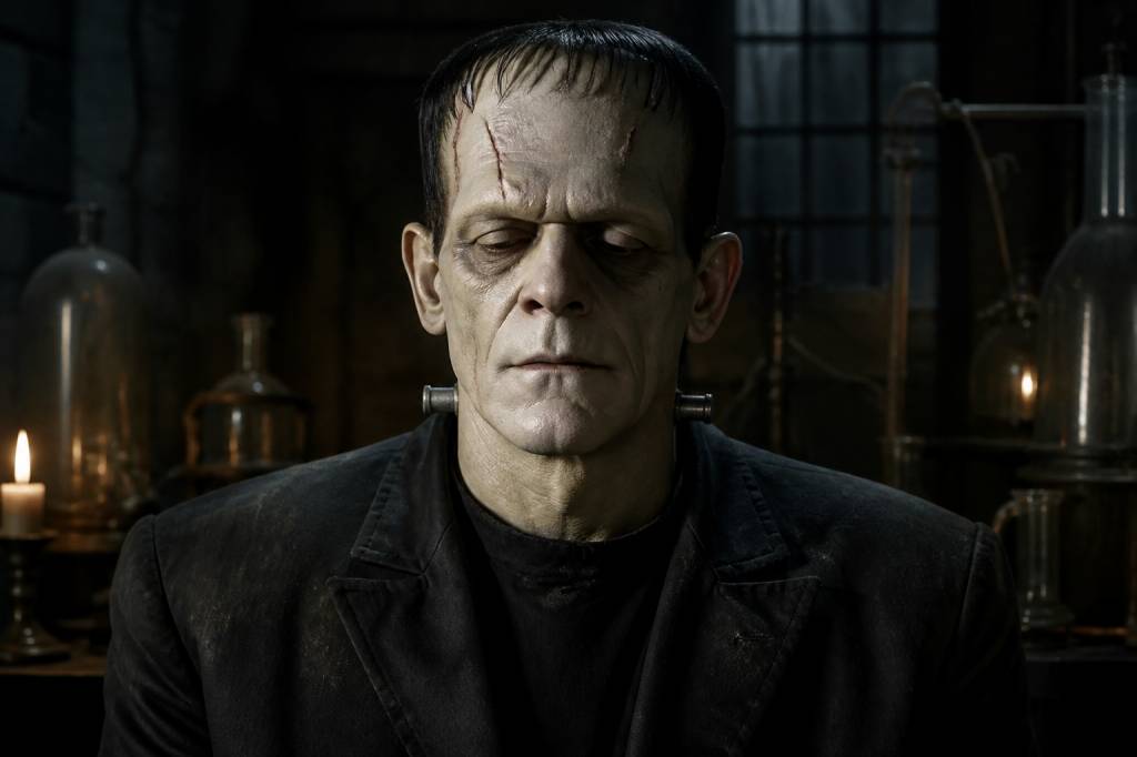
One of the most recognizable visual motifs in Frankenstein cover art is, ironically, not from Mary Shelley’s novel at all. The green-skinned, bolt-necked creature popularized by Boris Karloff’s 1931 film adaptation became the default image for “Frankenstein” in the broader culture. Book covers followed suit. By the middle of the 20th century, many editions were using a version of the Universal Monster aesthetic: a hulking figure, jagged shadows, and an electricity theme that suggested science gone terribly wrong.
This is a cultural sleight of hand that still confuses readers. Shelley’s creature is articulate, emotionally complex, and physically described in a way that is far less cartoonish than the movie version. Yet the iconic film imagery proved so durable that cover designers continued borrowing it. Why? Because it was instantly readable. A cover had to sell the story in a glance, and the Karloff-inspired monster did that efficiently. It said “horror” without requiring explanation.
But this shift also had consequences. It narrowed the public’s perception of the book. For many readers, the cover suggested a simple monster narrative rather than a meditation on ambition, responsibility, isolation, and creation. That distortion is part of Frankenstein’s cultural history. The cover art didn’t merely reflect the text; it actively rebranded it.
From Gothic literature to mass-market horror
The 1940s through the 1970s were a golden age for dramatic Frankenstein cover art. Paperback publishers knew what worked on crowded shelves: screaming faces, electrical arcs, twisted anatomy, and neon colors that seemed to have been chosen by a sleep-deprived mad scientist. These covers sold fear, not nuance.
Take the classic horror paperbacks of the mid-century period. Their visual language was often exaggerated to the point of pulp theater. The lab was almost always green or blue. The lightning was always too bright. The creature, if shown, was oversized and menacing. If not shown, the cover might feature a helpless woman, a looming castle, or a laboratory table set like an execution chamber. It was efficient marketing, but it also helped fix Frankenstein as a foundational horror property in the public mind.
This era reflects a broader shift in publishing. As paperbacks became affordable and widely distributed, cover art took on an outsized role in attracting casual readers. A serious literary title needed a visual hook. For Frankenstein, that hook was often pure menace. The result? The novel was packaged less as a Romantic-era philosophical work and more as a proto-slasher origin story. Subtle? Not exactly. Effective? Absolutely.
There is a reason these covers remain collectible today. They are documents of a particular cultural moment, when genre publishing and mass marketing converged to reshape the identity of a classic.
When designers leaned into the text instead of the monster
Not every cover fell into the trap of monster spectacle. Some of the most effective Frankenstein designs use restraint. Rather than showing the creature directly, they suggest themes of creation, fragmentation, and moral collapse through typography, composition, or symbolic imagery.
Minimalist editions often emphasize the novel’s literary credentials. A stark black cover with a single distressed line drawing can imply dread more elegantly than a fully rendered monster ever could. Broken type, stitched motifs, anatomical sketches, or a solitary laboratory image can evoke the novel’s central ideas without reducing it to a horror poster.
This approach respects what Shelley actually wrote. Frankenstein is not just about what the monster looks like; it is about the ethics of creating life and abandoning it. It is about the consequences of intellectual arrogance. It is about loneliness, rejection, and the human need for recognition. Designers who understand that tend to create covers that feel more enduring, even if they are less immediately sensational.
One reason these designs resonate is that they invite the reader to imagine the story rather than being told what to fear. In a market saturated with visual noise, that kind of confidence stands out. It says: this book does not need to scream to be disturbing.
Typography as atmosphere
Cover art is not only about images. Typography plays a major role in how Frankenstein is interpreted. Gothic serif fonts, cracked lettering, and oversized titles can all signal dread before a single visual element appears. Some editions use elegant classical typography to frame the novel as high literature. Others employ distressed type to suggest decay, decay being one of the few things the monster and many paperback edges have in common.
Typography can subtly shift the tone of the entire edition. A refined, minimalist font can make Frankenstein feel like a philosophical classic. A heavy, jagged font can make it feel like a midnight campfire warning. Neither is wrong. But each positions the book differently in the cultural marketplace.
That matters because cover art influences readership. A student encountering Frankenstein for the first time in school may respond very differently depending on whether the cover feels like a gothic relic, a feminist text, or a monster novel. The typography helps set expectations, and expectations shape reading. In that sense, the font is doing quiet but serious cultural work.
The feminist and political readings hidden in plain sight
Modern cover art has increasingly reflected new critical approaches to Shelley’s novel. As readers and scholars have emphasized the book’s themes of creation, bodily autonomy, scientific power, and isolation, covers have started moving away from simplistic horror imagery. Some recent editions highlight the figure of Victor Frankenstein as a transgressive creator rather than a heroic scientist. Others use imagery that evokes the fragmented body, alluding to questions about identity and control.
This shift is not trivial. It reflects broader changes in how literature is marketed and understood. As conversations around gender, science, and power have become more prominent, Frankenstein has been reclaimed as a strikingly modern text. Its cover art now often signals that relevance. In this sense, the novel has moved from being packaged as a monster story to being framed as a cultural critique.
That’s a significant evolution for a book written by a 19-year-old author in the early 1800s. Shelley’s novel has always been politically charged, but many older covers flattened that complexity into a single threatening face. Contemporary editions are more likely to acknowledge the text’s layered relevance: environmental anxiety, medical ethics, artificial life, and the loneliness built into modern innovation. Sound familiar? It should. The monster is still very much among us, only now it may have a lab coat or a user interface.
Why iconic Frankenstein covers endure
The best Frankenstein cover designs endure because they do more than decorate. They interpret. They distill. They create a visual shorthand for an entire set of ideas: creation and destruction, genius and hubris, beauty and grotesque transformation.
Some of the most iconic covers share a few qualities:
- A strong silhouette or central figure that is instantly legible
- Limited color palettes that create mood and tension
- Symbolic rather than literal imagery
- Typography that reinforces the novel’s Gothic or philosophical tone
- Visual ambiguity that leaves room for interpretation
Those qualities help a cover remain powerful across decades. A design that relies too heavily on a specific film image or a passing trend may date quickly. A cover built around atmosphere, contrast, and symbolism can survive changing tastes. That is why some of the most successful Frankenstein covers are not the loudest, but the smartest.
How cover art shapes cultural memory
It is easy to dismiss book covers as marketing. That would be a mistake. For a culturally saturated work like Frankenstein, the cover is part of how the story is remembered, taught, and even misunderstood. It influences what readers expect the novel to be, and those expectations shape the legacy of the text itself.
Think about how many people know “Frankenstein” as a monster before they know it as a novel. That recognition did not happen by accident. It was reinforced by decades of visual repetition across cover art, film posters, comic books, and merchandising. The image became a cultural shortcut. But the best covers challenge that shortcut instead of merely repeating it.
There is real value in that tension. The most memorable designs remind us that Shelley’s novel is not reducible to one face, one body, or one cinematic cliché. It is a book about the consequences of creation, the fragility of belonging, and the danger of treating life as an experiment. A good cover can capture that complexity in a single frame. A great one can make a reader feel it before the first chapter begins.
That is the strange power of Frankenstein cover art. It does not simply illustrate a classic. It helps decide what kind of classic the novel becomes for each generation. And in the case of Frankenstein, that visual legacy is every bit as haunting as the story itself.