


Swiss style design has a reputation that is both understated and oddly powerful. It does not shout. It does not chase attention. Yet, in modern interiors, it keeps showing up as the visual language of choice for people who want calm spaces that still feel sharp, current, and intentional. Why? Because Swiss style is built on principles that solve a very modern problem: how to make a room feel simple without making it feel empty.
At its core, Swiss style design is about clarity, order, precision, and restraint. It draws from the legacy of Swiss graphic design and architecture, where structure is not a limitation but a framework. In interiors, that translates into balanced layouts, disciplined color palettes, honest materials, and furniture chosen for function as much as form. The result is a space that feels timeless rather than trendy — and in an age of fast-moving aesthetics, that matters more than ever.
If you have ever walked into a room and instantly felt your shoulders drop, chances are the space was doing some Swiss-style heavy lifting. No visual noise. No clutter pretending to be personality. Just proportion, light, and a careful edit. Let’s break down the design principles that make this approach so enduring.
Clarity comes first
Swiss style design starts with a simple idea: every element should have a purpose. That does not mean a room must be sparse or cold. It means the layout is deliberate, and every object earns its place. In practice, this often leads to interiors with clear circulation paths, visible structure, and a strong sense of visual hierarchy.
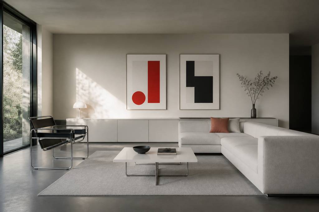
Think of it as the interior equivalent of well-edited journalism. The story is stronger because the unnecessary bits are gone. A Swiss-inspired living room, for example, might feature a low-profile sofa, a single sculptural chair, a restrained coffee table, and one or two carefully chosen art pieces. Nothing competes. Everything supports the whole.
This principle is especially effective in modern homes, where open-plan living can easily become chaotic. Without clear zones, an open space can feel like a showroom after a delivery truck has passed through. Swiss style avoids that by organizing the room with intention: a rug to anchor the seating area, lighting to define zones, and furniture positioned with precision rather than guesswork.
Neutral palettes, but never bland
Swiss style interiors are known for neutral colors, but that phrase deserves a better reputation. Neutral does not mean lifeless. In a well-designed Swiss-style space, whites, warm grays, charcoal, black, beige, and muted earth tones work like a disciplined ensemble cast. The palette is restrained so texture, light, and proportion can take the lead.
White walls are often used to maximize brightness and create a clean backdrop. But the real sophistication comes from variation within the neutral range. A room might pair matte plaster walls with a natural oak floor, a wool sofa, brushed steel accents, and linen curtains. The color stays calm, while the materials keep it from going flat.
There is also a practical reason for this restraint. Neutral interiors tend to age better. A rust-orange velvet sofa may feel irresistible today and surprisingly specific five years from now. By contrast, a toned-down palette gives you flexibility. You can refresh the room with accessories, art, or lighting without starting from scratch.
That said, Swiss style does not ban color. It simply uses it with discipline. A single cobalt blue chair, a red artwork, or a deep green ceramic vase can have real impact because there is room for it to breathe. In other words, the accent color works harder when the rest of the room is not already competing for attention.
Geometry and proportion shape the room
One of the most distinctive features of Swiss style design is its respect for geometry. This is not about making everything rigid or symmetrical for the sake of it. It is about creating harmony through proportion, alignment, and clean lines. Spaces feel composed because their elements relate to one another in a measurable, intentional way.
Rectangles, grids, and simple linear forms are common. You will often see furniture with crisp silhouettes, shelving arranged in orderly modules, and architectural details that emphasize structure rather than decoration. The room feels balanced because it has a visual rhythm.
This principle has roots in Swiss graphic design, where the grid became a powerful organizing tool. In interiors, the same logic applies. A well-placed bench under a window, a shelving unit that aligns with the ceiling height, or a series of pendant lights spaced evenly across a kitchen island can all create a sense of order without being rigid.
Proportion also matters at the scale of furniture. Swiss style tends to favor pieces that are elegantly scaled to the room. Oversized furniture can overwhelm the clean architectural lines. Too many petite objects, on the other hand, can make a space feel nervous and fragmented. The goal is balance, not visual gymnastics.
Material honesty is non-negotiable
If Swiss style has a moral center, it is this: use materials honestly. Wood should look like wood. Stone should look like stone. Metal should feel purposeful, not decorative for decoration’s sake. There is a quiet confidence in allowing materials to speak for themselves.
This is why Swiss-inspired interiors often feature natural finishes. Oak, ash, walnut, limestone, concrete, glass, wool, linen, leather, and steel all have a place here. They add depth without unnecessary ornamentation. A pale oak table with visible grain can bring warmth to a room dominated by white walls. A brushed metal lamp can introduce a precise, industrial note without making the space feel cold.
The tactile dimension is essential. A Swiss-style room should not only look composed; it should feel composed. The hand should want to touch the linen, the wood, the stone. Texture becomes the new decoration.
One practical example: instead of layering on patterned cushions and statement wallpaper, try a combination of materials with different finishes. Pair a smooth leather chair with a slubby wool throw. Place a matte ceramic bowl on a polished wood console. The contrast is subtle, but it gives the room a quiet richness that decorative clutter rarely achieves.
Function is part of the aesthetic
Swiss style design does not separate beauty from use. In fact, it insists they belong together. A well-designed room should be easy to live in. Storage should be integrated. Pathways should remain clear. Everyday objects should have a designated place. The aesthetic is not just visual; it is operational.
This is one reason Swiss style feels so relevant in modern interiors, where people increasingly want homes that work harder. A kitchen needs to be efficient. A living room may serve as a workspace. A small apartment might have to do the job of three different rooms. Swiss design offers a framework for making all that feel coherent rather than improvised.
Closed storage is particularly important. Open shelving can be beautiful, but only when edited with almost suspicious levels of discipline. Otherwise, it becomes a museum of mismatched mugs and cables. Swiss style prefers built-ins, hidden compartments, and furniture that resolves practical problems elegantly. Think storage benches, wall-mounted cabinets, and modular systems that disappear into the architecture.
The bonus is psychological. A functional space tends to feel calmer because it reduces friction. You are less likely to spend ten minutes hunting for keys, chargers, or that one notebook you swear was on the table yesterday.
Light is treated like a material
In Swiss style interiors, light is not an afterthought. It is part of the composition. Natural light is maximized wherever possible, with large windows, minimal window treatments, and reflective surfaces used to enhance brightness. But artificial lighting is just as carefully considered.
Rather than relying on a single overhead fixture, Swiss-inspired spaces often use layered lighting: ceiling lights for general illumination, task lighting for functional zones, and accent lighting to highlight artwork or architectural details. The aim is to create clarity without harshness.
Lighting fixtures themselves tend to be simple in form, with clean lines and minimal ornament. A slim pendant, a cylindrical table lamp, or a wall sconce with a precise silhouette can all fit the aesthetic. When design is this restrained, even the shadows start to matter. Yes, shadows. Swiss style treats them as part of the visual texture, which is perhaps the least dramatic but most sophisticated form of drama.
For homes in darker climates or city apartments with limited daylight, this approach is especially effective. The right lighting strategy can make a compact space feel larger and a minimal room feel more inviting. The key is to avoid flattening the room with too much uniform brightness.
Editing matters more than accumulation
Swiss style has little patience for excess. That does not mean every surface must be empty. It means every object should be chosen with care. Editing is central to the aesthetic. A room gains character not by stacking objects, but by selecting a few with real presence.
This is where many people go wrong with minimal design. They strip a room down, then add back a series of generic objects that do not earn their place. The result is not minimalism; it is design limbo. Swiss style avoids that trap by privileging quality over quantity.
Here are some useful editing questions:
If the answers are fuzzy, the object probably does not belong. Harsh? Maybe. Effective? Absolutely.
Swiss style interiors often display restraint in art as well. One large piece can have more impact than a wall packed with smaller frames. The same applies to decorative objects. A single ceramic vessel on a console table can read as intentional. Five objects in a cluster can read as an apology for not having stored them properly.
Typography’s influence is still visible in interiors
Swiss style originated in the world of graphic design, and that heritage still shapes how the aesthetic functions in interior spaces. The principles of grid systems, alignment, hierarchy, and visual clarity are just as useful in a room as they are on a page.
You can see this influence in the way modern interiors are laid out. Furniture aligns with architectural lines. Wall art is placed with exact spacing. Shelving systems are modular and modularity, in this context, is not a buzzword but a practical design logic. The room reads like a well-composed page: nothing is accidental, and the eye always knows where to go next.
This is one reason Swiss style has remained relevant across decades. It adapts easily to contemporary architecture, especially in spaces that already have strong structural lines. A loft, a new-build apartment, or a renovated townhouse can all benefit from this disciplined approach because it works with the architecture instead of fighting it.
How to bring Swiss style into a modern home
You do not need to rebuild your home from the ground up to borrow from Swiss style. The principles can be applied gradually, and often the smallest changes make the biggest difference.
Start by reducing visual clutter. Clear surfaces, hide cables, and remove objects that do not serve the room. Then focus on the core palette. Replace overly bright or mismatched accessories with a more cohesive set of neutrals and one or two accent tones.
Next, pay attention to materials. If your space feels flat, introduce contrast through texture rather than color alone. Add linen, wool, wood, stone, or metal depending on what the room needs. A mix of finishes can make even a simple arrangement feel considered.
Finally, refine the layout. Pull furniture away from the walls if it improves flow. Align pieces more carefully. Let the architecture guide placement. A chair shifted by twenty centimeters can sometimes change the entire mood of a room. Design people love saying that, and annoyingly, they are often right.
Useful starting points include:
Why Swiss style still feels modern
Timeless design usually survives because it answers a persistent need. Swiss style does exactly that. It offers order in a world that often feels overloaded, and it creates beauty without theatrics. In a cultural moment obsessed with speed, noise, and constant visual novelty, that kind of discipline feels almost radical.
Modern interiors do not need more things. They need better relationships between things. Swiss style understands that the space between objects matters as much as the objects themselves. It values silence, but not emptiness. Precision, but not rigidity. Function, but never at the expense of atmosphere.
That is why the style continues to resonate with architects, designers, and homeowners alike. It is not nostalgic, and it is not flashy. It simply works. And in design, as in journalism, that may be the highest compliment you can give.