


Mary Shelley’s Frankenstein has survived two centuries of adaptations, interpretations, misreadings, and reinventions. Yet one of the most revealing ways to track the novel’s cultural afterlife is not through film, but through its covers. A book jacket does more than package a text. It frames how readers are invited to see it: as Gothic horror, cautionary science fiction, feminist text, literary classic, or all of the above at once.
That is especially true for Frankenstein. Few books have been redesigned so many times, in so many radically different styles, for so many different audiences. Some editions lean into the storm-lit castle-and-lightning imagery that became shorthand for the story. Others strip the novel down to severe typography, suggesting a work of philosophical gravity rather than pulpy terror. A few manage to be both beautiful and unsettling, which is probably the most Frankensteinian outcome of all.
What makes these covers so compelling is that they often reveal as much about the era that produced them as they do about Shelley’s novel. The same story can be marketed as a monster tale in one decade and a tragic meditation on creation in another. In other words: if you want to understand how Frankenstein has been read over time, start looking at the jackets.
The cover as a cultural argument
Every book cover makes a claim. With a canonical novel like Frankenstein, that claim matters even more because the text comes with a dense set of expectations. Readers may know the creature’s name, the image of the stitched-together monster, or Boris Karloff’s square-headed cinematic shadow. But Shelley’s novel is more complex than its pop-culture afterlife. It is a story about ambition, abandonment, responsibility, grief, and the terrifying consequences of unchecked creation.
Designers have long wrestled with that complexity. Should the cover show the monster, or avoid him entirely? Should it signal horror, romance, science, or philosophy? Does the book need dramatic illustration to sell, or can it rely on the authority of its literary status?
The answer changes with the market. Mass-market paperbacks often emphasize immediacy and shock. Academic editions prefer restraint. Collector’s editions may go for luxury, embossing, foil, cloth spines, and a level of visual seriousness that says: yes, this is a classic, and no, we are not just here for the monster.
From Gothic spectacle to iconic shorthand
Early and mid-20th-century editions often leaned heavily on Gothic atmosphere. Think looming towers, storm clouds, lab equipment, graveyards, and dramatic silhouettes. This was the era when the novel was frequently framed as a horror story first and a literary text second.
The problem with that approach is simple: it can flatten the book. A cover that promises only thrills risks reducing Victor Frankenstein’s tragedy to a monster in the night. Still, these editions are fascinating because they helped cement the visual vocabulary we now associate with the novel. The lightning bolt. The icy blue palette. The oversized, threatening figure. The isolated laboratory. These images may not all come from Shelley’s pages, but they became part of the book’s public identity.
Some of the most memorable vintage editions used illustration in a way that feels almost theatrical. Their covers were designed to attract attention on crowded shelves, and they did so with exaggerated composition and high contrast. Today, they are collectible partly because they show how publishers once sold the novel as an event, not merely a text.
When minimalism meets menace
In more recent decades, many publishers have moved toward minimalist covers for Frankenstein. At first glance, that may seem like the opposite of the novel’s dramatic energy. But minimalism can be surprisingly effective here. A stark white cover, a single anatomical detail, or a restrained type treatment can suggest a colder, more intellectual reading of the story.
This is a smart move. Shelley’s novel is not only about fear; it is about ideas. Creation, power, language, isolation, and moral failure all sit at its center. Minimalist designs can communicate that the novel deserves to be read as a work of thought, not just of sensation.
Some editions use near-abstract imagery: a fragment of a body, a stitched seam, a shadowed profile, or even the suggestion of an experiment without directly naming it. These covers often feel modern because they trust the reader to bring their own familiarity to the text. In a sense, the absence of spectacle becomes its own form of spectacle.
And then there is the typography. A well-chosen serif font can do more work than a full illustration. Tall, sharp letterforms can evoke coldness and severity. Heavy black type can imply weight and doom. A distressed font may hint at decay. The best minimalist Frankenstein covers understand that the title itself already carries cultural charge.
Edgar Allan Poe energy, Victorian restraint, and everything in between
What makes the publishing history of Frankenstein so visually rich is that it sits at the crossroads of several design traditions. It can be presented as Gothic literature alongside Poe and Radcliffe. It can be packaged as a foundational science fiction text. It can be framed as a feminist landmark, a product of the Romantic era, or a philosophical novel about modernity.
Different editions reflect those possibilities.
- Gothic-inspired covers often use dark palettes, architectural ruins, and storm imagery.
- Literary editions may use restrained type, classical portraiture, or symbolic fragments.
- Science-focused editions sometimes highlight anatomy, alchemy, electricity, or laboratory motifs.
- Collector’s editions often combine tactile materials with elegant ornamentation to signal permanence and prestige.
That variety matters because it shows how flexible Shelley’s novel remains. A jacket can make the same story feel like a haunted romance, a proto-lab thriller, or a philosophical warning about creation gone wrong. The novel contains all of those readings. The cover simply chooses which one gets first access.
The best modern editions know when to avoid the monster
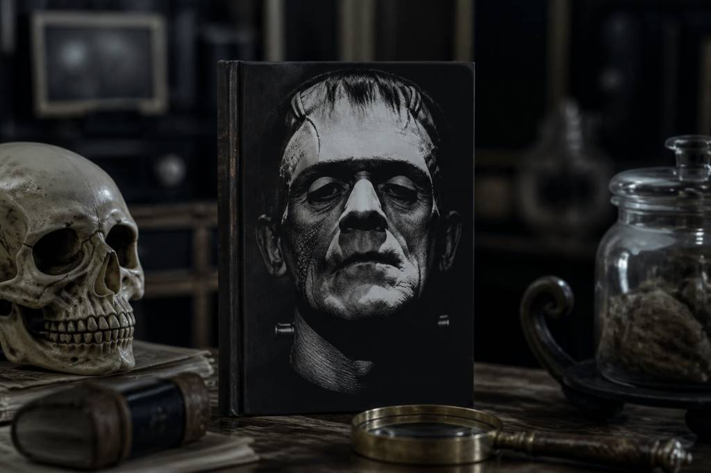
One of the smartest trends in contemporary Frankenstein design is the decision not to show the creature at all. This may sound counterintuitive, but it often produces the strongest result. Why? Because the monster is so famous that literal depiction can become cliché. The stitched face, the green skin, the bolts in the neck—those belong more to cinema than to Shelley’s original text.
By refusing the obvious image, designers can open space for nuance. A close-up of a hand suggests creation. A fragmented silhouette suggests identity in pieces. A cover dominated by empty space can evoke abandonment, which is one of the novel’s central emotional realities.
Some of the most effective contemporary editions play with absence. Instead of presenting the creature as a fixed icon, they hint at the unease surrounding his creation. This is a much more faithful move than it might appear at first. Shelley’s novel is, after all, deeply concerned with what cannot be controlled, contained, or fully seen.
There is also a practical advantage: avoiding the monster helps a cover feel less dated. Monster imagery can lock a design into a particular visual moment. Abstract or symbolic covers are more likely to age well because they are not tied to one dominant adaptation or costume style.
Collectible editions and the prestige of form
For readers and collectors, Frankenstein has become a favorite subject for deluxe publishing. Special editions often come with sprayed edges, foil stamping, cloth bindings, illustrated endpapers, and custom slipcases. These are not just cosmetic flourishes. They are part of how publishers reposition a canonical book as an object worth keeping, displaying, and gifting.
That makes sense for Frankenstein, a novel that has long occupied a strange space between classroom staple and cultural artifact. Deluxe editions tend to emphasize that status. They often use darker, richer materials and more deliberate composition, as if to say the book deserves ceremonial treatment.
Some particularly memorable editions have leaned into anatomical illustration, botanical motifs, or old-style engraving aesthetics. These choices work because they echo the period feel of the novel while avoiding the usual monster clichés. They also remind readers that Shelley’s world was one of scientific curiosity and intellectual experimentation, not just candlelit terror.
For younger readers entering the book through a new edition, this visual design can matter more than publishers admit. A striking cover can be the reason a 19th-century novel gets picked up in 2026 instead of being left to gather dust on a syllabus.
Why illustration still works
Even in an age of minimalist branding, illustration remains one of the strongest approaches for Frankenstein. Why? Because the novel thrives on tension between the human and the unnatural. Illustration can dramatize that tension without reducing it to a single image.
The best illustrated covers tend to do one of three things well: they create atmosphere, they suggest emotional conflict, or they reinterpret the creature in a way that feels fresh rather than derivative. The difference between those goals is important. Atmospheric illustration can be gorgeous but generic. A cover that captures emotional conflict usually lasts longer in memory.
Some artists use layered textures, scratched linework, or distorted anatomy to imply instability. Others use composition to isolate Victor or his creation within a hostile landscape. The result is often more powerful than a literal monster portrait because it acknowledges that the novel’s true horror is structural: the breakdown of duty, kinship, and moral responsibility.
The recurring problem of the “famous monster” cover
There is a reason so many Frankenstein covers look familiar. The novel has been absorbed into visual culture so thoroughly that many designs recycle the same shorthand. But familiarity can be a trap.
When every edition uses the same laboratory lightning and looming figure, the book starts to look smaller than it is. That is unfortunate, because Shelley’s novel has had a major influence on modern thought about biotechnology, artificial intelligence, ethics, and the danger of playing creator without accepting responsibility. A cover that merely shouts “monster” misses that larger relevance.
Good design resists that flattening. It asks what the book means now, not only what it meant in the era of gas lamps and grave robbers. A visually strong cover can bridge those worlds. It can nod to Gothic tradition while still feeling contemporary enough for a shelf next to current literary fiction or speculative nonfiction.
What the best editions understand about Shelley’s novel
The strongest Frankenstein editions share one important trait: they treat the novel as bigger than its most famous image. They understand that the creature is only one part of the story, and perhaps not even the most important part. The real drama lies in pursuit, responsibility, loneliness, and the cost of refusing care.
A cover that captures that complexity does not need to be loud. It just needs to be precise. A single surgical seam. A frozen landscape. A face turned away. A title set with eerie restraint. These details can suggest more than a full-page monster illustration ever could.
That is why the most striking book jackets for Frankenstein are not necessarily the most obvious. They are the ones that make readers pause. They create a slight delay between recognition and interpretation. And that pause is where the novel still lives: not as a museum piece, not as a creature feature, but as a work that keeps asking what it means to create, to abandon, and to be responsible for what you bring into the world.
If a book cover can do all that in a single glance, it has done more than sell the novel. It has entered into conversation with it.